Logo
The logo for the Interlaken tourism region emphasizes our Swiss heritage and our tradition as a tourist destination. It consists of two elements: The “Lake Cross” and the “Signature”.
The “Lake Cross”
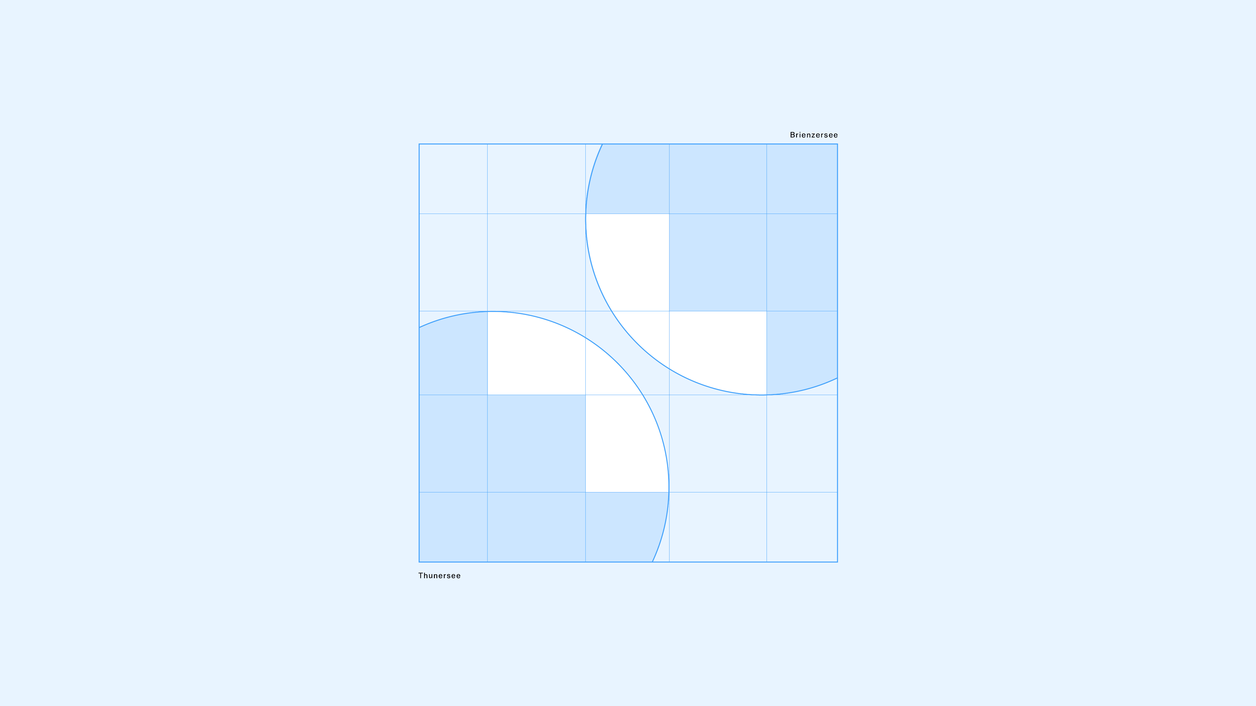
The “Lake Cross” is a reimagined version of the Swiss cross. The rounded halves represent Lake Thun and Lake Brienz, the two lakes between which Interlaken is nestled.

Structure
The design of the “Lake Cross” is modeled after the official Swiss cross.
Safe zone
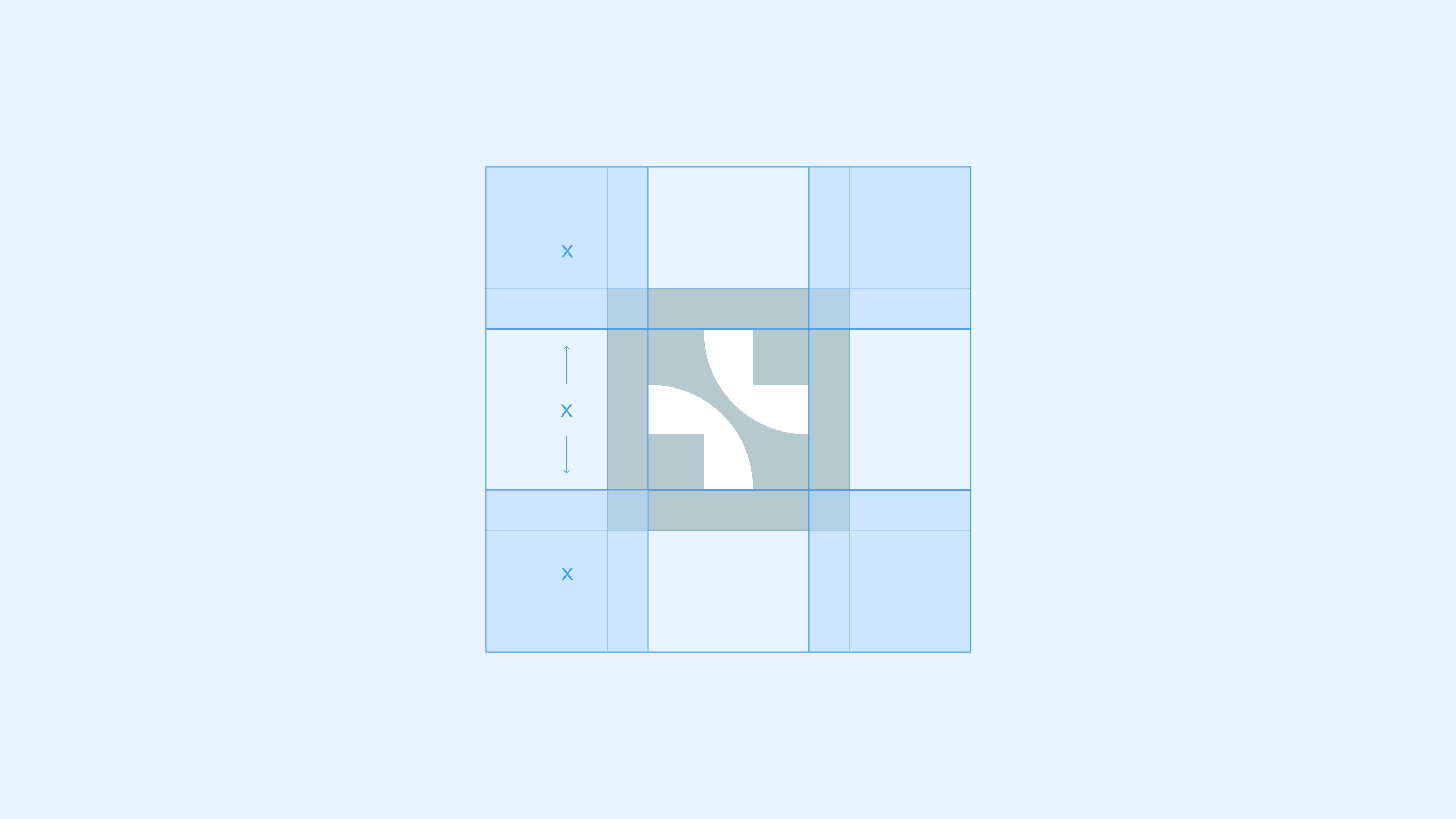
The height and width of the white “Lake Cross” define x. The clear space is 1x, measured from the “Lake Cross”.
Incorrect use
The following rules apply to the “Lake Cross”:
Do not scale the “Lake Cross” up or down
Don not rotate the “Lake Cross”
Do not change the colour of the "Lake Cross" in isolation
Do not use an outline
Do not change the orientation of the "lakes"
Do not use gradients
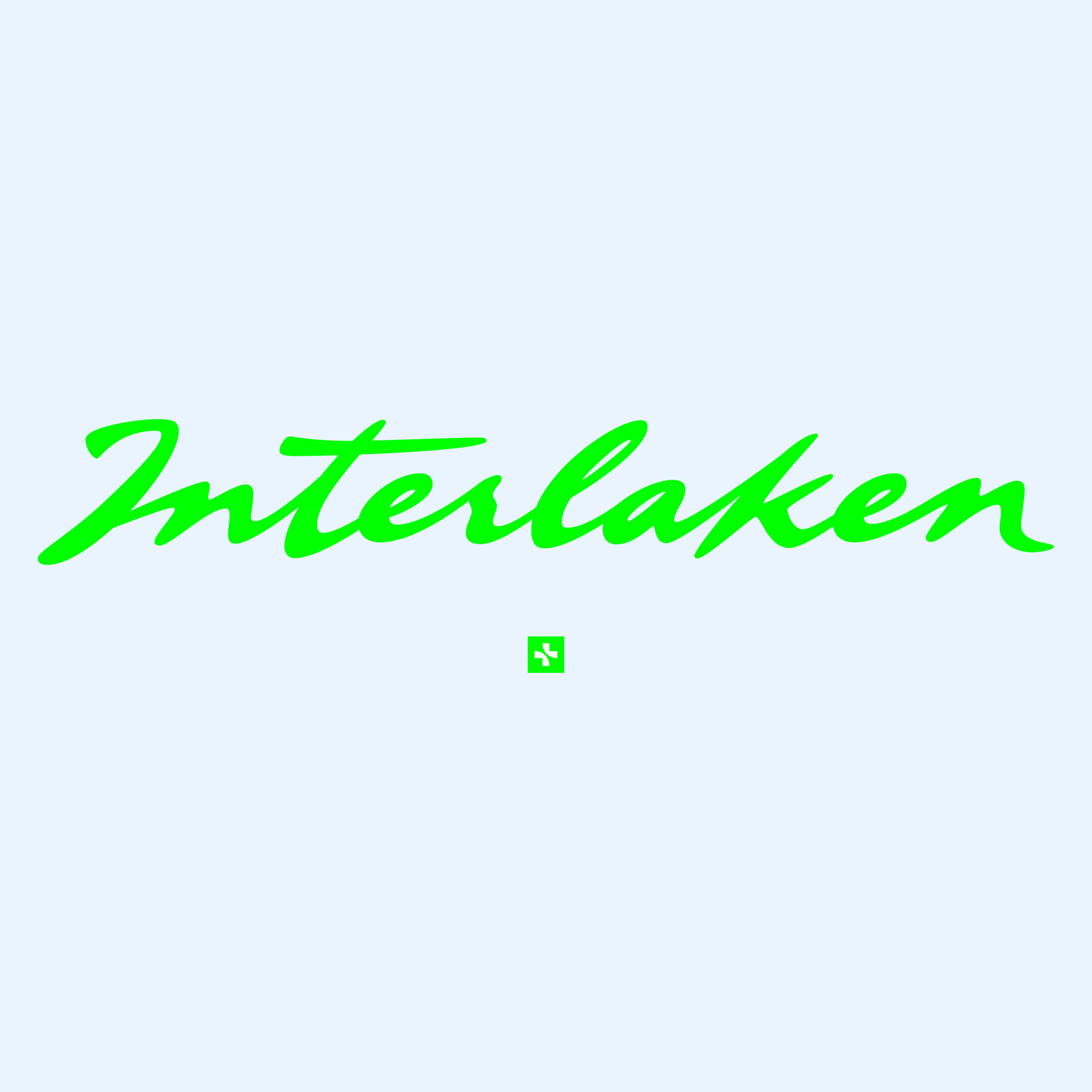
The “Signature”
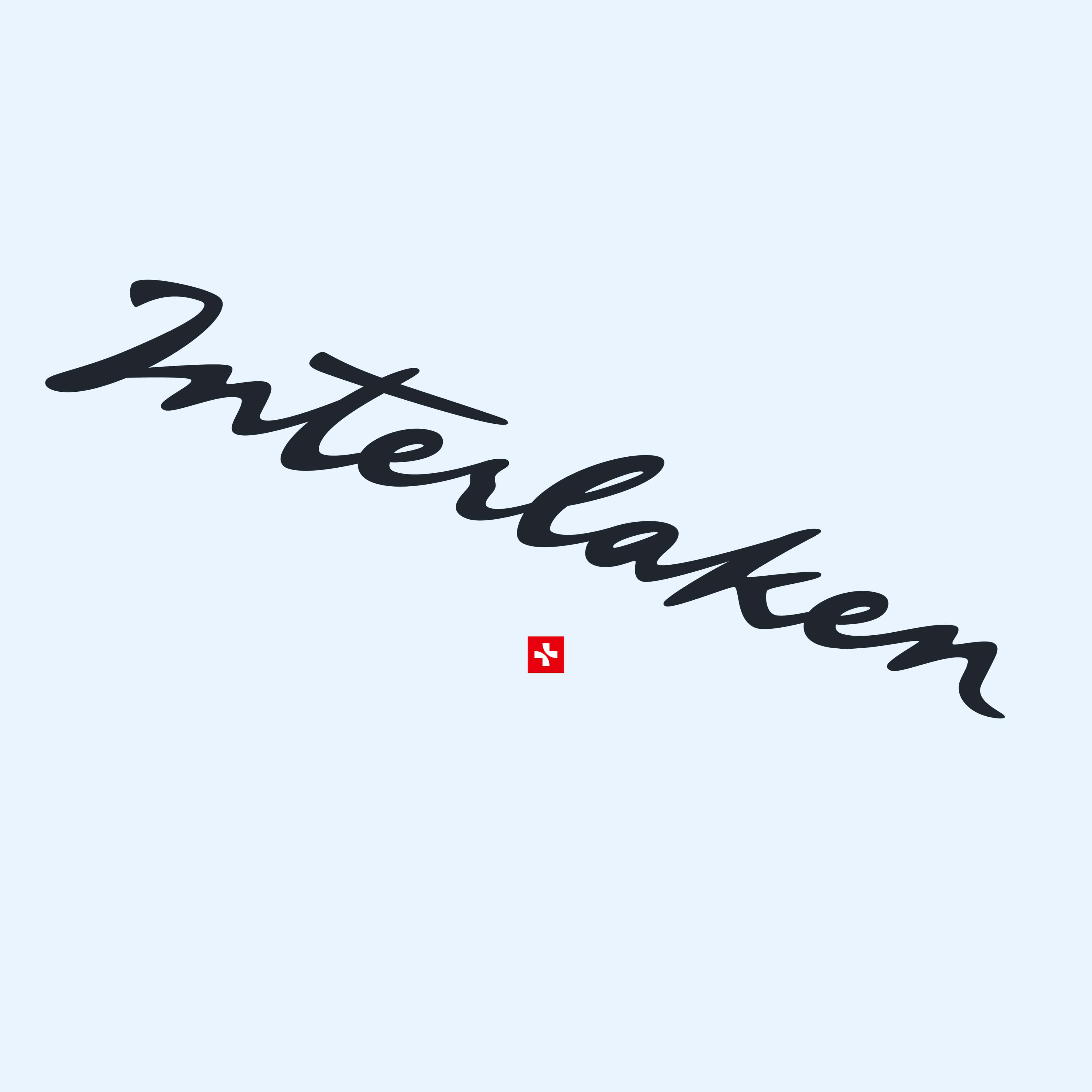
The “Signature” is inspired by a similar logo from our past and underscores our longstanding tradition as a tourist destination.
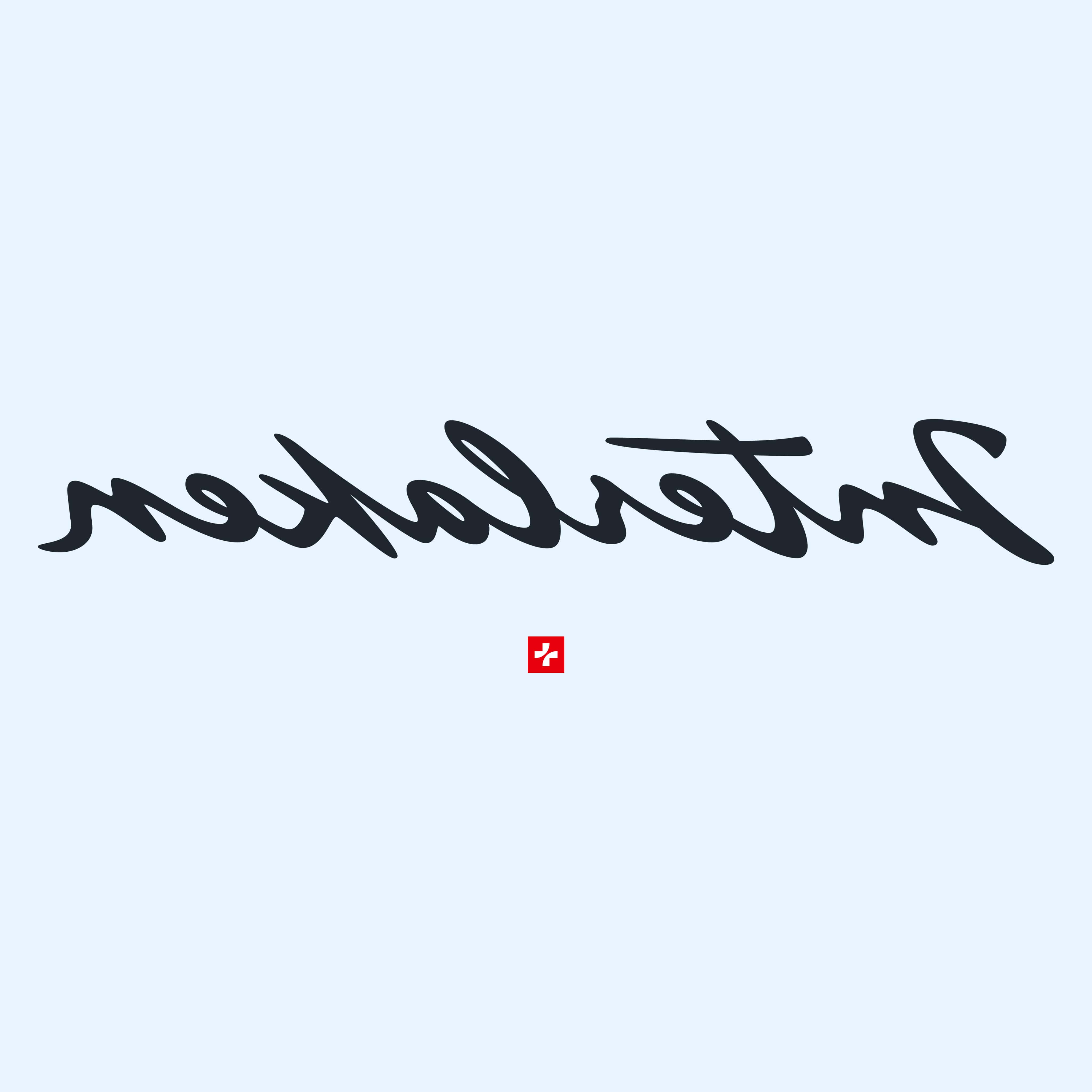
Heritage
The historic signature that served as inspiration for the design of the “Signature”.

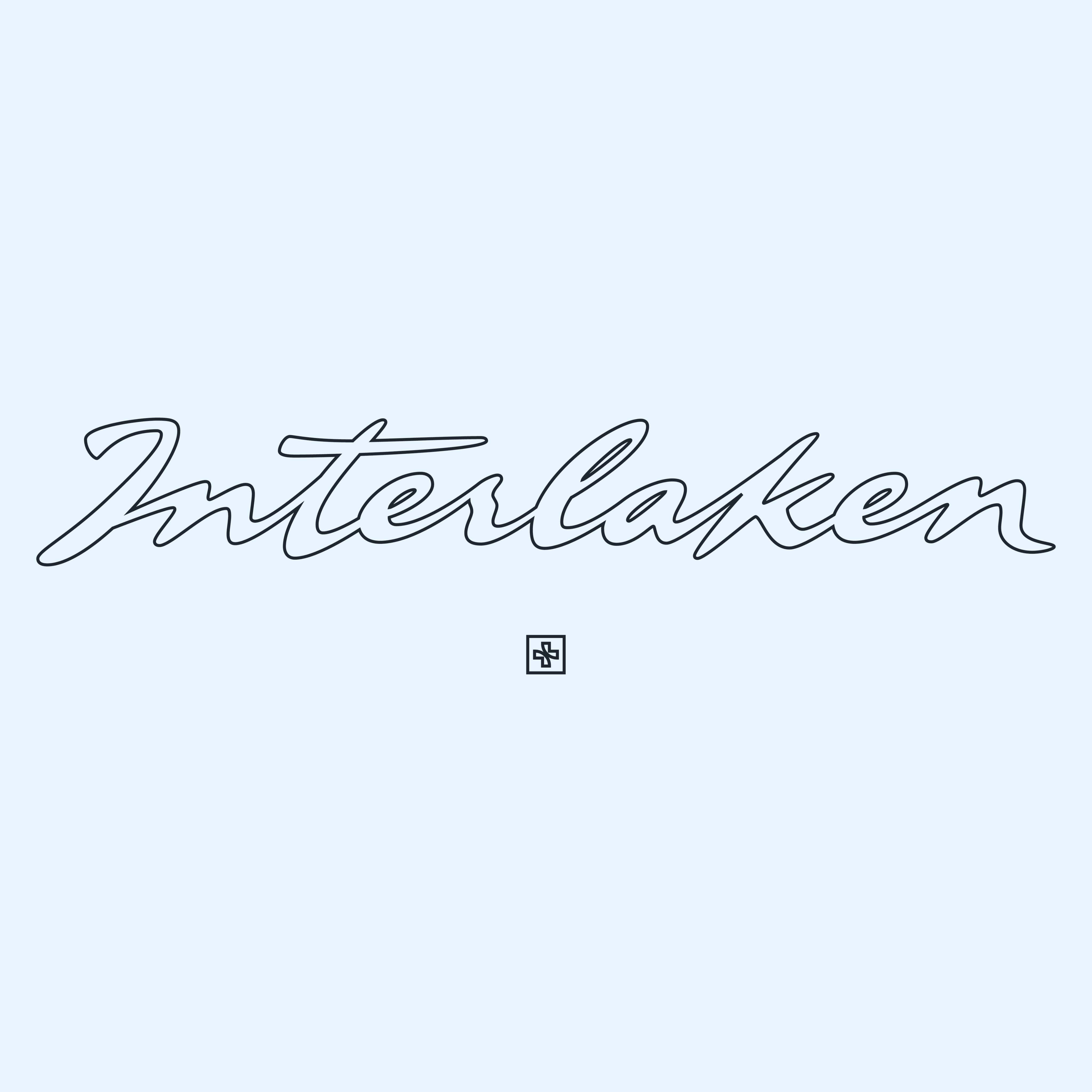
Safe zone
The height of the “Signature” – measured from the p-line to the H-line – defines x. The exclusion zone around the “Signature” is ¼x.

Incorrect use
The following rules apply to the “Signature”:

Do not distort

Do not rotate

Do not change the colour of the "Signature" in isolation

Do not use an outline

Do not mirror

Do not use gradients
Horizontal logo
The “Lake Cross” and “Signature” are combined horizontally to form the logo.
Safe zone
The height of the “Lake Cross” defines x. The exclusion zone to the left and right is 1x, top and bottom is 2x.
Minimum height
The minimum height for all applications is 3.5 mm.
Incorrect use
The following rules apply to the horizontal logo with “Lake Cross” and “Signature”:

Do not distort

Do not rotate

Do not change the color

Do not use an outline

Do not mirror

Do not use gradients
Vertical logo
The “Lake Cross” and “Signature” are combined vertically to form the logo. There are several options for this:
The “Signature” above the “Lake Cross”
The height of the “Signature” – measured from the p-line to the H-line – defines x. The “Lake Cross” is placed ¼x below and centred at ¼x size.
The “Lake Cross” above the “Signature”
The “Lake Cross” is placed at minimum 2x ¼x above the “Signature”, at a size of ¼x. It may be positioned higher in ¼x increments, but not lower.
Structure
The “Lake Cross” can be moved up or down in ¼x increments, following the size of the format.
Incorrect use

Do not distort
Do not rotate
Do not change the color
Do not use an outline
Do not mirror

Do not use gradients
Vertical logo with headline or tagline
For ads, posters and other large-format applications, the “Lake Cross”, “Signature” and headline / tagline can form a unit. The “Lake Cross” is always centred between the “Signature” and the text.